Color psychology
What is the “psychology” of colors?
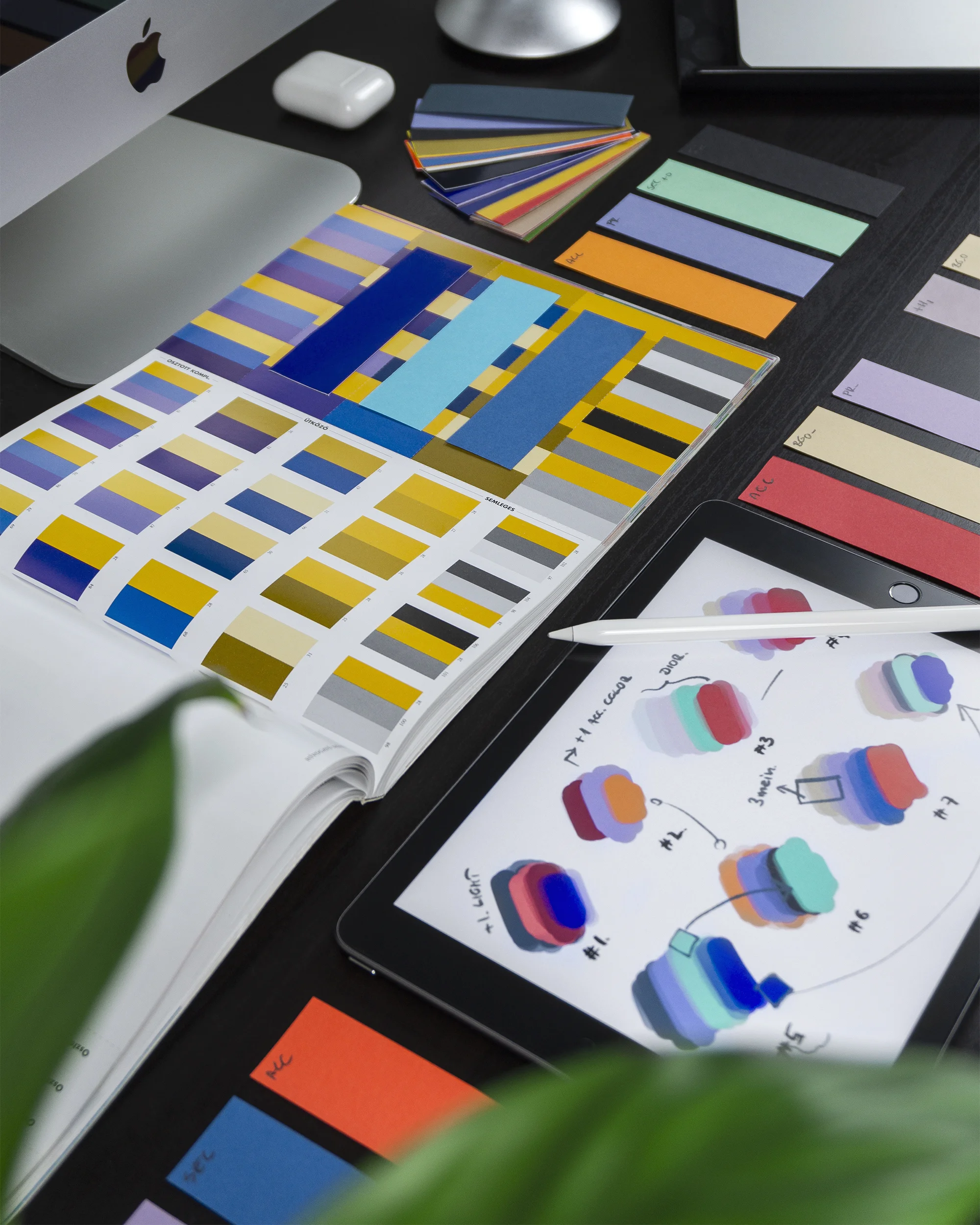
Color psychology is the idea that colors evoke feelings, and that’s a powerful tool for you to harness in the logo and colors for your brand. Notice how colors make you feel—what memories and dreams they elicit, both negative and positive. Think about some of your favorite brands. What colors do they use? Now, think about the audience for your brand. What colors might they respond to and why? You can also check out some common color associations below.
How does the psychology of color work?
Each classic color and its various shades tends to tap into certain emotions.
Yellow
Yellow is associated with optimism, clarity, and warmth. These are the positive aspects of yellow but it is also the color of caution so be mindful of how you’re using it and maybe use a hue that is more gold. An advantage of yellow is that its brightness helps it stand out among all the other colors.
Orange
Orange is creative, youthful, and enthusiastic. If you want an attention-getting hue, try orange. It’s confident and fun. Orange is especially popular for kid-related brands.
Red
Red is warm, exciting, sexy, and urgent. If you want yours to be a brand of action, maybe red is for you. This is a popular choice for retailers since it may induce a sales-related urgency.
Purple
Purple reminds us of grandeur, opulence, and mysticism with shades of wisdom and imagination. That “anything is possible” vibe is attractive to businesses that want their audience to believe their brand can make things happen.
Blue
Blue means strength, dependability, and tranquillity. There’s a reason so many of the apps on your phone are blue. These are qualities brands wants to be associated with.
Green
Green is serene and peaceful, and it conveys the idea of growth. This is why green is a popular color for brands related to health, nature, and the environment.
Or should you stick with Black & White? Black is professional and credible, but it can be edgy as well. White, on the other hand, is clean and pure. Using them together or including shades of gray can create a feeling of “balance and simplicity.”
Why are colors important for my business?
You want your business to project a specific vibe, and the colors you choose are a big part of that. Picking a few colors for your business will give it an overall look that is cohesive and recognizable. You’ll want to pick colors as you develop your logo, but these colors will have a presence beyond the logo. Even if your logo is only one or two colors, you’ll most likely need others to use for your website, product packaging, and all the materials that will be associated with your business.
Pro Tip
Check out our favorite platforms and resources for thinking more about design and colors:
And here is a great free tool for creating color palettes:


